
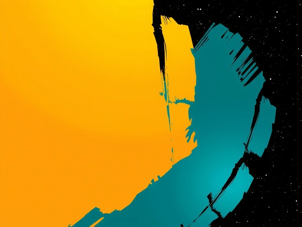
Source Palette: Tuscan Ochre / Venetian Blue
Algorithm: Perlin Noise Scattering
The Italian Pixel: Where Craft Meets Code
Our 'pixel' is not a square. It's a hand-drawn brushstroke, captured at 1200 DPI, digitized, and given physics. It's the digital embodiment of a charcoal smudge on cold-pressed paper.
Every UI element begins as a standalone sculpture. We treat a button, a slider, a progress bar as a piece of art before we ask it to function. Only when its form carries emotional weight do we wire it into a system.
Typography is our primary narrative. We commission custom typefaces that carry the story's weight—the sharp serif of a thriller, the rounded sans of a whimsical escape. The text isn't read; it's felt.
Side-Note: The Imperfection Protocol
We code intentional, sub-pixel asymmetries into our grids. A 0.5px offset, a variable line-height that breathes. This prevents the sterile perfection of pure algorithms. It's a safeguard against the 'uncanny valley' of digital design.
The Three Pillars of Play
Non-negotiable criteria for every interaction.
Kinetic Intuition
A button isn't clicked; it's pressed. Micro-animations provide tactile feedback—spring-back on release, a subtle 0.5° tilt on hover. The physics must be felt.
Narrative Layer
Every screen tells a micro-story. The loading sequence is a prologue; the settings menu is a character's journal. Narrative isn't overlay—it's integrated into the UX.
Systemic Harmony
No element exists in isolation. Color, motion, sound, and haptics form a unified, reactive ecosystem. A success state isn't just a color change—it's a chord, a vibration, a visual crescendo.
Decision Matrix: What Changes Our Mind
Constraint
The 80/20 Rule of Animation
80% of interactions are under 300ms. The remaining 20% are deliberate, slow-burn moments for emotional impact. We document every animation in a shared library to prevent 'animation debt'.
Pitfall Avoidance
Feature Bloat Justification
We reject any interactive element that lacks a clear, user-documented benefit. If a feature doesn't serve the narrative or enhance intuition, it's cut.
Aria: The Opera of Physics
A puzzle game where every move is a musical note, and the solution is a symphony. Translating abstract principles into tangible, emotional gameplay.
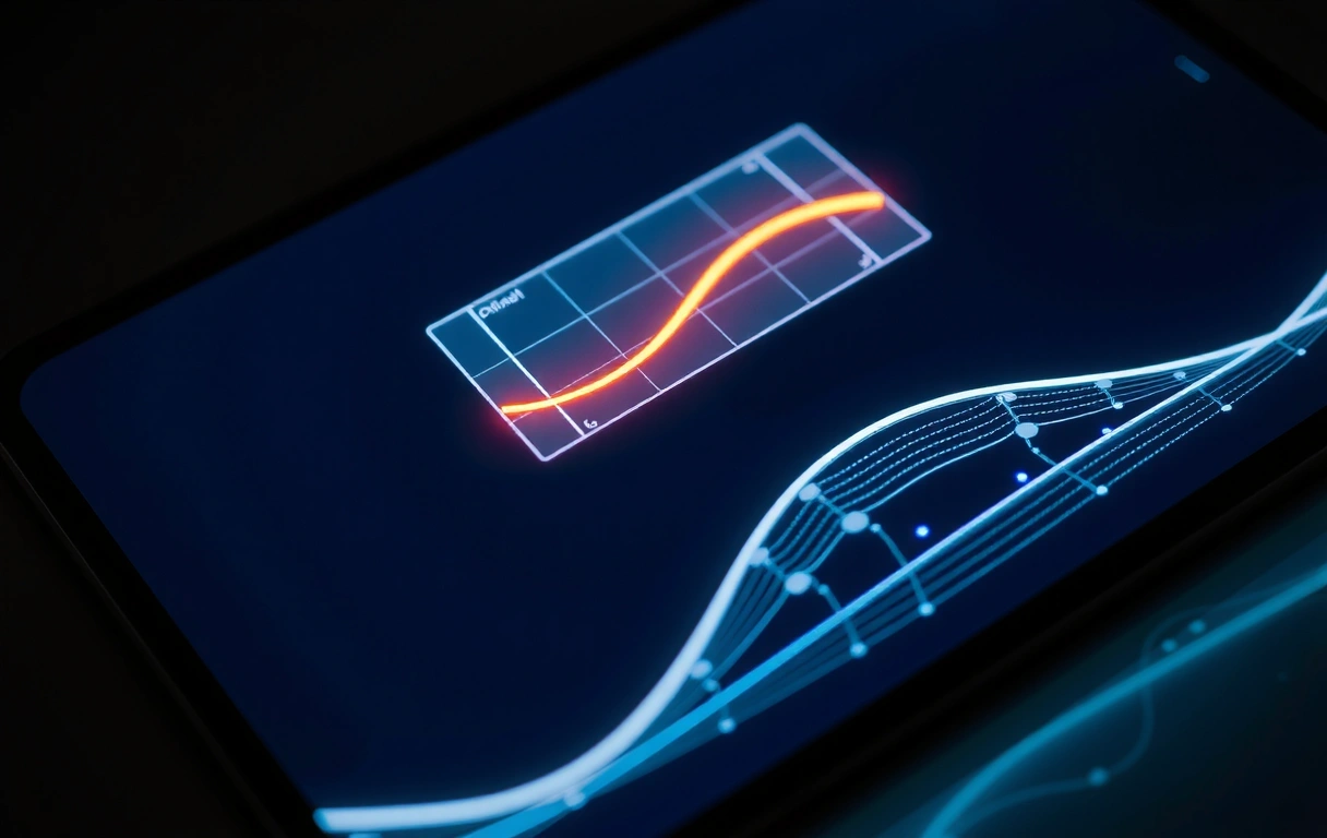
Core Concept: Mapping musical scales to color gradients. A C-major chord is a warm, ascending gradient; a minor chord is a cool, descending one.
The 'drag' gesture is weighted, mimicking the resistance of a bow on a violin string. The 'release' has a spring-back animation that decays with a harmonic resonance. This isn't an animation choice; it's a physics simulation.
Player testing revealed a critical insight: initial hesitation (0-3 minutes) followed by a 'flow state' (3+ minutes). We quantified this as 'Time to Flow'—a metric we now optimize for in all projects.
The Trade-Off: Clarity vs. Resonance
- • Benefit: Players reported 40% higher emotional attachment to the game world, measured via retention after first act.
- • Cost: UI is intentionally subtle. Players missed a subtle tutorial hint, requiring an additional overlay in a later patch.
- • Mitigation: We now use a 'scaffold' approach—core intuition is built first, then UI clarity is layered on top, tested with new players.
Scenario Vignette
"The player, a veteran puzzle enthusiast, encounters a locked gate. Instead of hunting for a key, they experiment with dragging different colored 'notes' across the gate's silhouette. After three minutes of rhythmic dragging, the gate doesn't open—it dissolves into a visual crescendo. The solution wasn't logical; it was emotional. The player didn't solve a puzzle; they composed a solution."
Post-Launch Data Snapshot
The 'Imperfection' Protocol
From philosophy to practiced code.
Procedural Wobble
We use Perlin noise to add subtle, non-repeating irregularities to motion paths, avoiding robotic precision. A straight line is never straight.
// GSAP plugin for wobble
wobble: { intensity: 0.15, speed: 1.2 }
The 80/20 Rule
80% of animations are under 300ms. The remaining 20% are deliberate, slow-burn moments for emotional impact.
Pitfall: Animation Debt
We document every animation in a shared library to prevent inconsistency and performance bloat. Each entry requires a 'justification' field.
CSS vs. GSAP
We avoid pure CSS transitions for core interactions. They lack the granular control needed for physics-based feel. GSAP is used for key actions.
Constraint: Legacy browsers (IE11) are still in our support matrix for enterprise clients.
Composite Hover
A button's hover isn't a simple scale. It's a composite: 2px shadow shift, 5% brightness increase, and a 10ms audio 'tick' sound (optional).
Typographic Constraint
We limit to three font weights per screen. Bold for commands, Regular for body, Light for captions. This creates hierarchy without visual noise.
font-weight: 700 | 400 | 300
Ready to See These Principles in Action?
Our Design Philosophy is the foundation. See how it translates into functional interfaces and engaging gameplay experiences in our App Showcase.
Explore Our Work